Happy Friday!!! We made it through the first week of school. Before you hurry off to enjoy your long Labor Day weekend, we invite you to learn a little bit more about our new theme, LESS. BUT BETTER, and the accompanying designs and artwork.
Today, we welcome guest blogger, Sage Theule. Sage is our Design and Marketing Manager as well as the Primary art teacher. As a SLOCA grad and recent Biola grad with a degree in Studio Arts, Sage is immensely qualified to speak to this topic. So read on and join the conversation.
And be sure to read to the end where we announce our SLOCA mug giveaway!
You may not have expected to see a nude posted on SLOCA walls or printed on SLOCA shirts.
You may not have wanted to see nudity anywhere near SLOCA campus…ever.
This is just to say, we know and understand. This is also to communicate to you why we think it’s valuable anyway.
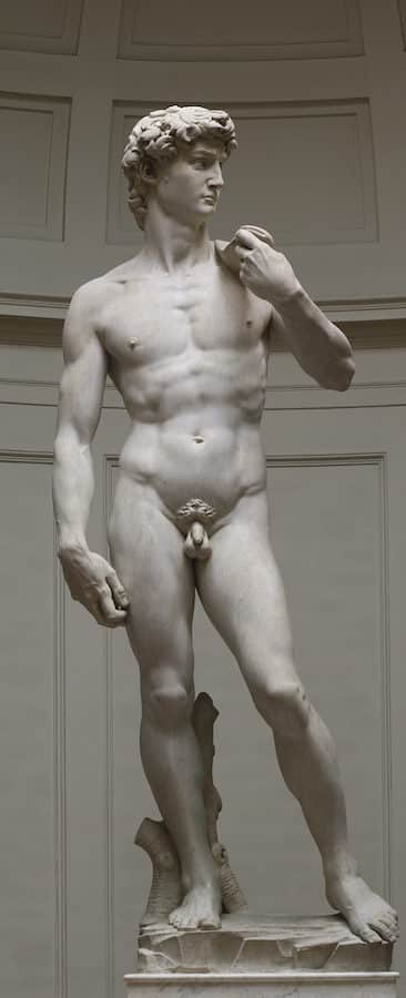
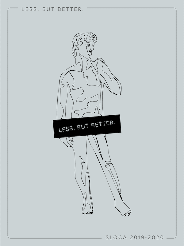
Let’s start with the basics: our design. Around the office, we call it the “LESS. BUT BETTER David” or “LBB David” or just “David.” If you’ve visited our campus recently, you’ve seen posters at least on your way to the Little Playground, if not in your child’s classrooms. And you may have strolled through the Den only to be confronted by new shirts featuring “LESS. BUT BETTER.” and a line drawing of Michelangelo’s David.
Maybe you laughed, maybe you were offended, maybe you were even angered. But whatever your feelings were, we hope it also made you think.
Because that’s what art is supposed to make you do: feel and think.
Now, we don’t necessarily think our little LBB David is great art. But the real David certainly is. And sometimes art has to make a splash in order to make a point. Go into any art museum in Italy, especially in Rome and Florence, where much of the Renaissance was played out, and you will see dozens, if not hundreds, of nude statues and paintings. Many of us take the nude for granted as one of the hallmarks of both the Renaissance and the Classical art ages. In reality, the Renaissance nude, in the midst of shifting religious and cultural values, was controversial. According to Giorgio Vasari, an art historian from the Renaissance, one of the staff members to the then-Pope, Biagio da Cesena, was publicly critical of the “shameful” nudes in another of Michelangelo’s works, The Last Judgment. In response, Michelangelo is said to have painted Biagio—quite unflatteringly—as the judge of Hell.
If you’re offended by our David, we’re not going to paint you as the villain in our next masterpiece, but we do ask that you open your mind to discussion, to join a conversation that has, broadly, been going on for centuries. To start you off, here are some of our reasons for the LESS. BUT BETTER David:
First, we set out with the goal of creating a LESS. BUT BETTER theme graphic that integrated into our study of history. But in a time and place recovering from the ravages of war and the Black Death, what Europe probably needed, and what it got with the Renaissance, was actually MORE. We struggled at first to find some connection with LESS. BUT BETTER and a time period that’s defined by a rush and re-flourishing of ideas, art, discoveries, and more.
But then we thought of the nude. There are lots of reasons for the influx of nude paintings in the Renaissance, but one of them is that Michelangelo and other humanistas (read: Renaissance humanists) believed that the human body (as well as all other parts of the human), is special and deserves to be celebrated! If the David was wearing MORE clothing, this masterpiece would almost certainly be WORSE.
Of course, we’re not saying that, in every context, LESS clothing is BETTER or even remotely appropriate. In many situations, especially public ones, it is better to be covered. But that’s where prudence comes in. We must always choose to do the right things in the right time. In this case, we must choose to showcase the glory of humanity, in our bodies and otherwise. We think that when we look at Michelangelo’s David—and even our LBB David as a shadow of the original—it is one of the RIGHT times to appreciate humans and all they can accomplish.
That being said, we have chosen to censor our David. Some may be offended by this as well. Throughout history, there have been waves of censorship associated with devastating ideology; Nazism, for example, comes to mind as an extreme example. But it seems here’s where we can again exercise our prudence. It is perfectly appropriate for us to view and appreciate nudity in the Galleria dell’Accademia in Florence, but it may not be appropriate for us to showcase full nudity on materials meant to represent a school for small children. You’ll notice we have a separate t-shirt design for our littles—without even the semi-nudity. Does this mean we don’t want you to have conversations with your children or that we’ll abstain from all such conversations here at school? No. At SLOCA, we don’t shy away from tough conversations. But we want to be prudent with what we’re putting out there into the world and with what assumptions people outside our community may make about us, especially about young children.
We’re not naive to dangers out there in the world. Our culture is often, as so many have pointed out, oversexualized. But that’s partly why this art is important for us today as well. There is always more to the human body than sex appeal. And no, in this design, we’re not making a joke about size.
But we do think our David is fun and a little funny. If you’ve read Greg McKeown’s Essentialism, you’ll know that LESS. BUT BETTER is about pursuing the right things rather than more things. This is often an incredibly difficult—even painful—endeavor. Sometimes you might have to say no or carve out precious time just to think in the midst of crazy busyness. With our LESS. BUT BETTER David, we’re seeking to add a certain lightheartedness and fun to something that might seem heavy and taxing.
So there you have it: our defense of David. Our goals were to have fun, connect our year theme to our history cycle, and invite dialogue. Consider this your formal invitation to the conversation!
Let’s continue to seek together— with Michelangelo and with the true essentialist—the good, the true, and the beautiful.
And now for the winner of our SLOCA mug. Drumroll, please……..Congrats to Heather MacLeod-Schulz! Visit Brenda in the Den to collect your mug.
Have a fabulous Labor Day weekend!


6 thoughts on “In Defense of David”
Thank you for the thoughtful explanation Sage. I think it’s always better to have more conversations about the things that make us and others uncomfortable.
So the bookstore already has the T-shirts for sale and I hope SLOCA can recoup what was spent. And I have no idea how well they are currently selling. I do want to say that this particular idea for a t-shirt should have been thought through better. I appreciate the long well thought out defense but somehow I feel like it would have been better to have spoken to a few more people about it before deciding on it. It was risky.
This design is definitely a result of lots of conversations prior to putting the David on our tees and posters this year––we asked quite a few people, had lots of discussions, asked opinions, and gathered these all into what you read in this post. And, the tees are selling quite well––almost sold out on a few! We welcome continued conversation on this topic, adding to what’s been said above, hopefully face to face! Thanks for joining in, Pam!
Well, first of all, the line drawing of David is beautifully rendered, and interesting all on its own, with or without the theme tie-in.
But since we’re talking about apparel, is there a shirt option that has the SLOCA logo, and says something about SLOCA being a school (ex: “educating for life” or something along those lines)? If I’m going to agree with the premise of using my attire to prompt conversations with strangers in the community, I would love for those conversations to directly increase awareness, and demonstrate support of our wonderful school.
I find myself telling people (mostly young moms at the park, or the library, or MOPs) about SLOCA all the time, and while I’m sure a circuitous conversation about LBB David would eventually come around to SLOCA being a great option for children and their families, it would be helpful to have a more direct path. Most people I talk to (outside of SLOCA families) have no idea that our school exists as an option for their children, but are relieved to hear it.
Again, the David is very cool! But is there an option that directly raises awareness of our school, and what makes it different?
Thank you Melissa!
We have lots & lots of gear options that say SLOCA (the Semper Discentes sweatshirt is a particularly great option for conversations directly about the school––”is that Latin?!”). Most all of our clothing says our school name on it somewhere, and so for the annual theme tees, we opted to leave it off. This makes it accessible to those who may like the shirt but don’t attend SLOCA, or it’s a nice option if you don’t want to wear a SLOCA branded tee out on the town every day (though we wouldn’t discourage that practice), but still support your school.
What’s your favorite SLOCA tee that you own, or which has offered the best segways into conversations about our school?
Love it! Art appreciation that runs the curriculum line and motto for the year is a great idea. I find it unfortunate that some sexualize the art that David is- that the human body is. Can’t wait to get the shirts, hope you order more! THIS is part of what I love about SLOCA.